Visualizations and Interactives
Visualizations of the full Historical Thesaurus database have been produced by the project since the completion of its full database in 2008. On these pages, we share some of these images, which you are welcome to download and use.
As well as the simple graphs below, from the links to the left you can also find more detailed treemap and lexicalization sparkline visualizations.
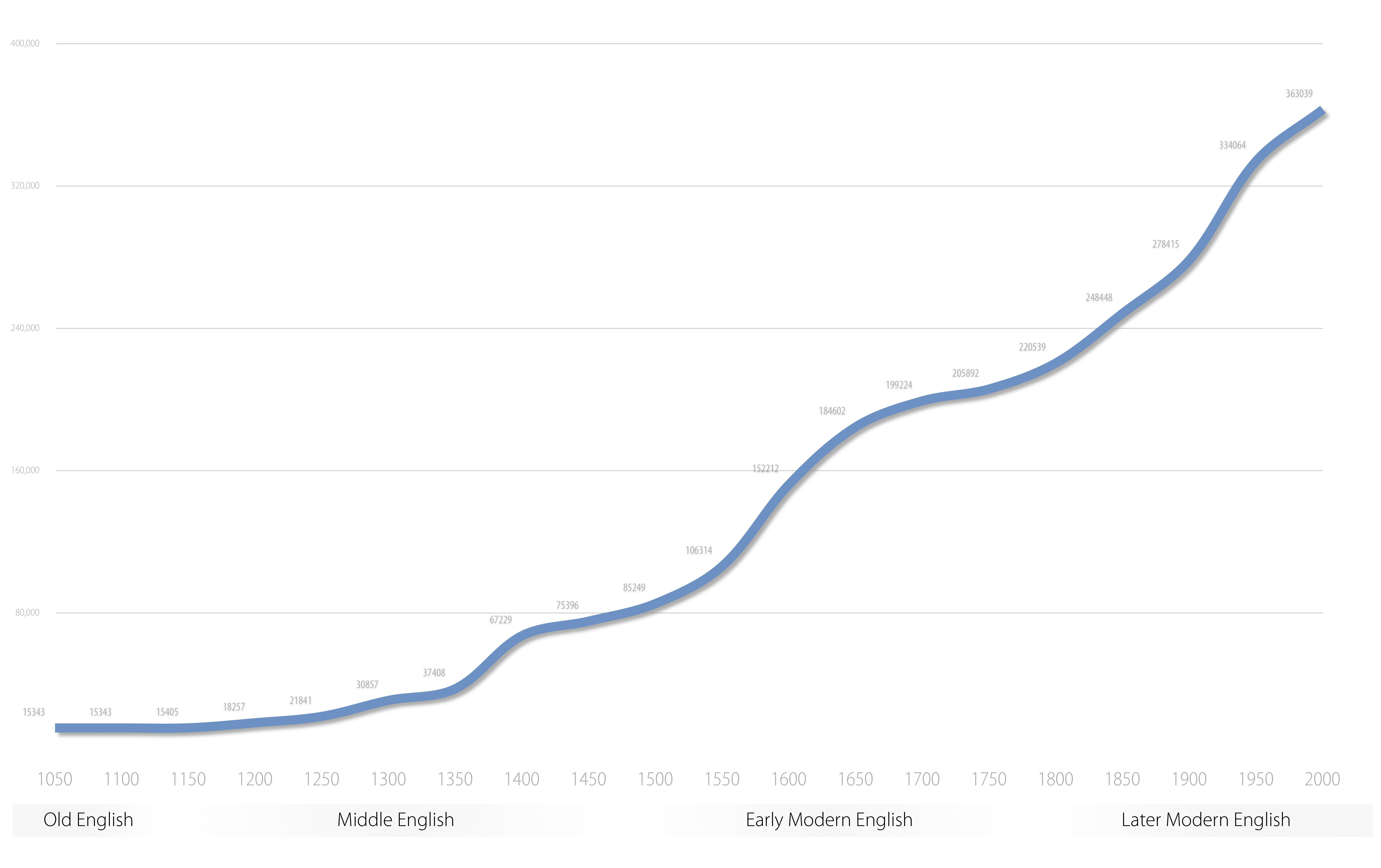
This shows the straightforward rise in the recorded vocabulary of English across time. Periods of rapid growth tend to occur during times of rapid social or intellectual change.
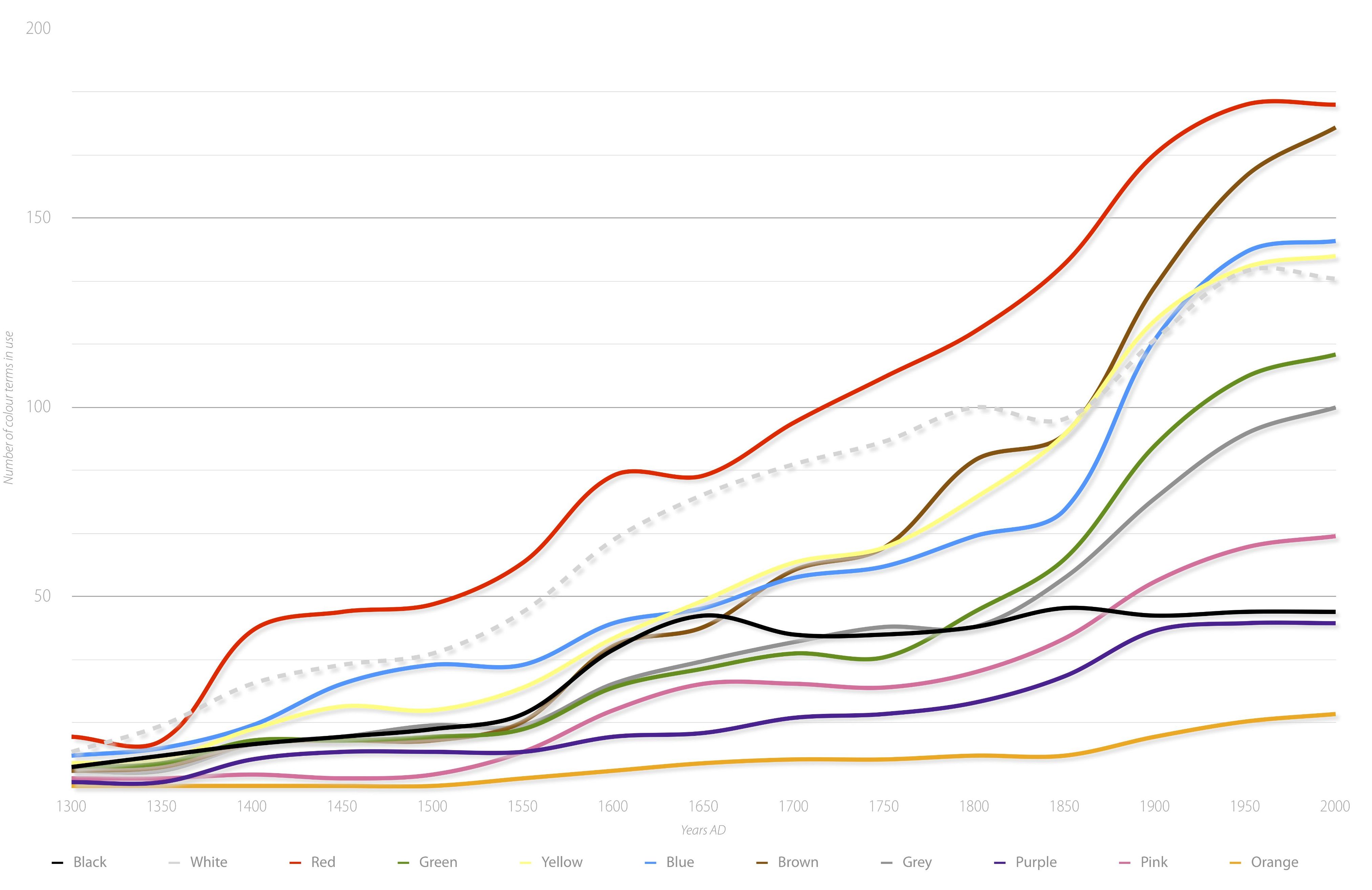
To show one area in detail, this graph takes all the nouns and adjectives for each major colour (each line self-coloured, with white in dotted grey) and shows the growth in size of each colour category across the history of English. Each line has peaks and dips, but the overall trend is to accumulate more and more words for each colour. There are some clear patterns – red is consistently larger than the rest, and black tails off in recent centuries, with not many new words for the concept in the past 200 years, whereas white experiences a peak during the same period. Yellow, blue and brown all cluster around each other, moving in tandem. This graph deliberately divides pink from red, in contrast to Thesaurus policy (as pink is not a separate basic colour for most of the history of English). For more detail on this colour data, including a discussion of the makeup of each category, see Alexander and Kay 2014.